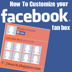
Facebook Like Box is very useful widget to show visitors the authority and love of the people for his blog. Facebook offers a simple Like Box plugin that you can easily integrate into your website But the default Facebook like box is not having good look at ugly all. This tutorial will show you How To Add Cute Custom Facebook Like Box using CSS To Blogger. Facebook Like Box is the best way to get more fans on Facebook. A Fan Box allows great attract your Blog more visitors or readers to like your Facebook fan page not leaving the like go here. you don't need to do any think you only need to copy and paste the code. Im Sure that this Cool Customize Facebook Like Box With CSS widget attracts your facebook fans increase the count of Likes.
How To Add a Custom Facebook Like Box to Your SiteNow let's start adding it...
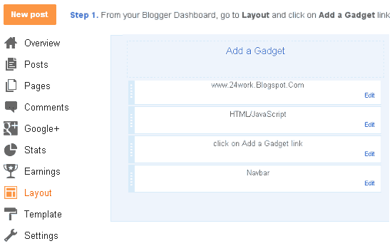
Step 1. Login to Your Blogger Account.Go to your Blogger Dashboard.Click on Layout tab from left pane and click on Add a Gadget link.
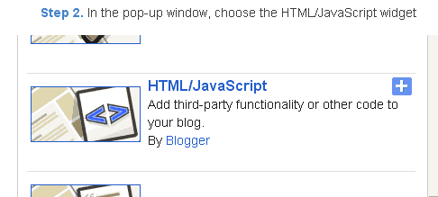
Step 2. After click on Add a Gadget link A pop-up box will open now
with many gadget list, Choose HTML/JavaScript from the gadget options by clicking the blue plus sign for that gadget.
Step 3. Select 'HTML/Javascript' and add the one of code given below.
Step 4. Now Click On Save 'JavaScript' You are done.
Note:- Replace pages%2FBlogspot-tutorial%2F220888831260608 With your Facebook User name
Style 1:-
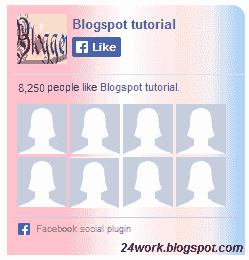
<div style="background: url('https://blogger.googleusercontent.com/img/b/R29vZ2xl/AVvXsEgLuE5qpIfhkXY2dwKmzIqAawRq3aQuG7Mnj6Lqu7gqzm1UUe9qDTdxkHzW9hdzmpgJp5tpmiPK_QWLvofn7b5mDEjtRrkTLYr0nEN_BwJ8s2tKiPjylnPwLHpZ_1D7i7Enjkq9ZkuW0WXj/s1600/fan-01-pic.png');overflow:hidden;border-radius: 110px;.height:250px;width: 238px;border-radius: 0px 13px 0px 0px;overflow: hidden;"><div style="height: 250px; overflow: hidden;"><a href="http://24work.blogspot.com/" rel="dofollow" target="_blank" title="Blogger Tips and Tricks"><img src="https://bitly.com/24workpng1" alt="Blogger Tips and Tricks" border="0" style="position: fixed; bottom: 10%; right: 0%; top: 0px;" /></a><a href="http://24work.blogspot.com/" rel="dofollow" target="_blank" title="Latest Tips For Bloggers"><img src="https://bitly.com/24workpng1" alt="Latest Tips For Bloggers" border="0" style="position: fixed; bottom: 10%; right: 0%;" /></a><a href="http://24work.blogspot.com/" rel="dofollow" target="_blank" title="Blogger Tricks"><img src="https://bitly.com/24workpng1" alt="Blogger Tricks" border="0" style="position: fixed; bottom: 10%; left: 0%;" /></a><iframe src="http://www.facebook.com/plugins/likebox.php?href=http%3A%2F%2Fwww.facebook.com%2Fpages%2FBlogspot-tutorial%2F220888831260608&width=250&height=258&show_faces=true&header=false&stream=false&show_border=false" scrolling="no" frameborder="0" style="border:none; overflow:hidden; width:250px; height:258px;" allowTransparency="true"></iframe>
</div>
</div>
And now click
Save Style 2:-

<div style="background: url('https://blogger.googleusercontent.com/img/b/R29vZ2xl/AVvXsEhgBiZdWb4zgIwYEWWRIIBppnNkepUHBSn8V_8QEnQs6pINZ2ZKTwazEupex3WsMN-nmrR6HX0cy3xrE_ahXEPgzMuN1kL4M-W8ip7-JmR_qa8XZs32P-4FLqkieJBwBADo7mRt__0qs2Qk/s1600/fan-02-pic.png');overflow:hidden;border-radius: 110px;.height:250px;width: 238px;border-radius: 0px 13px 0px 0px;overflow: hidden;"><div style="height: 250px; overflow: hidden;"><a href="http://24work.blogspot.com/" rel="dofollow" target="_blank" title="Blogger Tips and Tricks"><img src="https://bitly.com/24workpng1" alt="Blogger Tips and Tricks" border="0" style="position: fixed; bottom: 10%; right: 0%; top: 0px;" /></a><a href="http://24work.blogspot.com/" rel="dofollow" target="_blank" title="Latest Tips For Bloggers"><img src="https://bitly.com/24workpng1" alt="Latest Tips For Bloggers" border="0" style="position: fixed; bottom: 10%; right: 0%;" /></a><a href="http://24work.blogspot.com/" rel="dofollow" target="_blank" title="Blogger Tricks"><img src="https://bitly.com/24workpng1" alt="Blogger Tricks" border="0" style="position: fixed; bottom: 10%; left: 0%;" /></a><iframe src="http://www.facebook.com/plugins/likebox.php?href=http%3A%2F%2Fwww.facebook.com%2Fpages%2FBlogspot-tutorial%2F220888831260608&width=250&height=258&show_faces=true&header=false&stream=false&show_border=false" scrolling="no" frameborder="0" style="border:none; overflow:hidden; width:250px; height:258px;" allowTransparency="true"></iframe>
</div>
</div>
Style 3:-
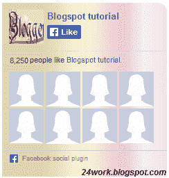
<div style="background: url('https://blogger.googleusercontent.com/img/b/R29vZ2xl/AVvXsEjKQ9YJmN7pPOglkgoj-S-8iy3mKGxeiz4gZuDZOiwa1-UfYLMUJYN3Nzslo4OyoMyLNmxp2r7Cn7EEyLCOMY08VyaLlJCEvhy7SM7RsnMUxZ8ORr0kRdtxagTiwUHkLGCxeA4sAyB47MXP/s1600/fan-03-pic.png');overflow:hidden;border-radius: 110px;.height:250px;width: 238px;border-radius: 0px 13px 0px 0px;overflow: hidden;"><div style="height: 250px; overflow: hidden;"><a href="http://24work.blogspot.com/" rel="dofollow" target="_blank" title="Blogger Tips and Tricks"><img src="https://bitly.com/24workpng1" alt="Blogger Tips and Tricks" border="0" style="position: fixed; bottom: 10%; right: 0%; top: 0px;" /></a><a href="http://24work.blogspot.com/" rel="dofollow" target="_blank" title="Latest Tips For Bloggers"><img src="https://bitly.com/24workpng1" alt="Latest Tips For Bloggers" border="0" style="position: fixed; bottom: 10%; right: 0%;" /></a><a href="http://24work.blogspot.com/" rel="dofollow" target="_blank" title="Blogger Tricks"><img src="https://bitly.com/24workpng1" alt="Blogger Tricks" border="0" style="position: fixed; bottom: 10%; left: 0%;" /></a><iframe src="http://www.facebook.com/plugins/likebox.php?href=http%3A%2F%2Fwww.facebook.com%2Fpages%2FBlogspot-tutorial%2F220888831260608&width=250&height=258&show_faces=true&header=false&stream=false&show_border=false" scrolling="no" frameborder="0" style="border:none; overflow:hidden; width:250px; height:258px;" allowTransparency="true"></iframe>
</div>
</div>
Style 4:-
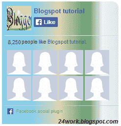
<div style="background: url('https://blogger.googleusercontent.com/img/b/R29vZ2xl/AVvXsEiIHHqWISwY-gU35UzK39K5zQaabuoDvEie9LF8n8k7xGP_FSwsP7UBIbsHGNOCCrRewXig9U1_GSFNdf633mT1LEHnezyYnMvT8S0psQvl4z7mE5M67S2ztqEBLD_Uf7LZGiOj_TPIZTTM/s1600/fan-04-pic.png');overflow:hidden;border-radius: 110px;.height:250px;width: 238px;border-radius: 0px 13px 0px 0px;overflow: hidden;"><div style="height: 250px; overflow: hidden;"><a href="http://24work.blogspot.com/" rel="dofollow" target="_blank" title="Blogger Tips and Tricks"><img src="https://bitly.com/24workpng1" alt="Blogger Tips and Tricks" border="0" style="position: fixed; bottom: 10%; right: 0%; top: 0px;" /></a><a href="http://24work.blogspot.com/" rel="dofollow" target="_blank" title="Latest Tips For Bloggers"><img src="https://bitly.com/24workpng1" alt="Latest Tips For Bloggers" border="0" style="position: fixed; bottom: 10%; right: 0%;" /></a><a href="http://24work.blogspot.com/" rel="dofollow" target="_blank" title="Blogger Tricks"><img src="https://bitly.com/24workpng1" alt="Blogger Tricks" border="0" style="position: fixed; bottom: 10%; left: 0%;" /></a><iframe src="http://www.facebook.com/plugins/likebox.php?href=http%3A%2F%2Fwww.facebook.com%2Fpages%2FBlogspot-tutorial%2F220888831260608&width=250&height=258&show_faces=true&header=false&stream=false&show_border=false" scrolling="no" frameborder="0" style="border:none; overflow:hidden; width:250px; height:258px;" allowTransparency="true"></iframe>
</div>
</div>
Style 5:-
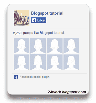
<div style="-moz-box-shadow: 0px 15px 20px 0px #777777; -webkit-box-shadow: 0px 15px 20px 0px #777777; background-color: #f4f4f4; border-radius: 15px; border: 1px solid #CCCCCC; box-shadow: 0px 15px 20px 0px #777777; height: 270px; margin: 30px; padding: 10px 0 10px 10px; width: 250px;"><div style="height: 250px; overflow: hidden;"><a href="http://24work.blogspot.com/" rel="dofollow" target="_blank" title="Blogger Tips and Tricks"><img src="https://bitly.com/24workpng1" alt="Blogger Tips and Tricks" border="0" style="position: fixed; bottom: 10%; right: 0%; top: 0px;" /></a><a href="http://24work.blogspot.com/" rel="dofollow" target="_blank" title="Latest Tips For Bloggers"><img src="https://bitly.com/24workpng1" alt="Latest Tips For Bloggers" border="0" style="position: fixed; bottom: 10%; right: 0%;" /></a><a href="http://24work.blogspot.com/" rel="dofollow" target="_blank" title="Blogger Tricks"><img src="https://bitly.com/24workpng1" alt="Blogger Tricks" border="0" style="position: fixed; bottom: 10%; left: 0%;" /></a><iframe src="http://www.facebook.com/plugins/likebox.php?href=http%3A%2F%2Fwww.facebook.com%2Fpages%2FBlogspot-tutorial%2F220888831260608&width=250&height=258&show_faces=true&header=false&stream=false&show_border=false" scrolling="no" frameborder="0" style="border:none; overflow:hidden; width:250px; height:258px;" allowTransparency="true"></iframe>
</div>
</div>
Style 6:-
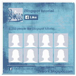
<div style=".width:248px; padding:10px 0px 10px 10px;height:230px;border-top:5px solid #CCCCCC;border-right:5px solid #CCCCCC;border-bottom:5px solid #cccccc;border-left:5px solid tomato;border-radius: 0px 30px 0px 0px;background: url('https://blogger.googleusercontent.com/img/b/R29vZ2xl/AVvXsEi3s92sMxqhrmSWQ8fINt4SpEnorm6yNlYJR97mc-uWneMJM9JO4k_I7T1xXCYaH90GF9Kck6obJS-ZiSdQ4S0gSW1NRk6OI7GIetup4c7YPYrx1QD7Mq8G3L6mDVIxYbCICk3crs-aevv0/s320/3783098647_fb208001b5.jpg');overflow:hidden;.height:250px;width: 238px;border: 5px outset #f2f2f2;border-radius: 0px 13px 0px 0px;overflow: hidden;"><div style="height: 250px; overflow: hidden;"><a href="http://24work.blogspot.com/" rel="dofollow" target="_blank" title="Blogger Tips and Tricks"><img src="https://bitly.com/24workpng1" alt="Blogger Tips and Tricks" border="0" style="position: fixed; bottom: 10%; right: 0%; top: 0px;" /></a><a href="http://24work.blogspot.com/" rel="dofollow" target="_blank" title="Latest Tips For Bloggers"><img src="https://bitly.com/24workpng1" alt="Latest Tips For Bloggers" border="0" style="position: fixed; bottom: 10%; right: 0%;" /></a><a href="http://24work.blogspot.com/" rel="dofollow" target="_blank" title="Blogger Tricks"><img src="https://bitly.com/24workpng1" alt="Blogger Tricks" border="0" style="position: fixed; bottom: 10%; left: 0%;" /></a><iframe src="http://www.facebook.com/plugins/likebox.php?href=http%3A%2F%2Fwww.facebook.com%2Fpages%2FBlogspot-tutorial%2F220888831260608&width=250&height=258&show_faces=true&header=false&stream=false&show_border=false" scrolling="no" frameborder="0" style="border:none; overflow:hidden; width:250px; height:258px;" allowTransparency="true"></iframe>
</div>
</div>
Style 7:-
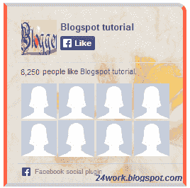
<div style=".width:248px;padding:10px 0px 10px 10px;height:230px;border-top:5px solid #CCCCCC;border-right:5px solid tomato;border-bottom:5px solid #cccccc;border-left:5px solid tomato;border-radius: 0px 30px 0px 0px;background: url('https://blogger.googleusercontent.com/img/b/R29vZ2xl/AVvXsEjqofQSVpTY6qzzw7Y5bfC9eyJnGTTBz7M17XtmSykEwo37LT7wfhlrVlOUnRtpUffYe6yRP_2hel7upsEdh25SW-OXVbvKwXT_A9IdPWtQCYVbVTIRk5HFTX9usW-gR4Jpzl258u8vDYAZ/s1600/image4.png');overflow:hidden;border-radius: 110px;.height:250px;width: 238px;border-radius: 0px 13px 0px 0px;overflow: hidden;"><div style="height: 250px; overflow: hidden;"><a href="http://24work.blogspot.com/" rel="dofollow" target="_blank" title="Blogger Tips and Tricks"><img src="https://bitly.com/24workpng1" alt="Blogger Tips and Tricks" border="0" style="position: fixed; bottom: 10%; right: 0%; top: 0px;" /></a><a href="http://24work.blogspot.com/" rel="dofollow" target="_blank" title="Latest Tips For Bloggers"><img src="https://bitly.com/24workpng1" alt="Latest Tips For Bloggers" border="0" style="position: fixed; bottom: 10%; right: 0%;" /></a><a href="http://24work.blogspot.com/" rel="dofollow" target="_blank" title="Blogger Tricks"><img src="https://bitly.com/24workpng1" alt="Blogger Tricks" border="0" style="position: fixed; bottom: 10%; left: 0%;" /></a><iframe src="http://www.facebook.com/plugins/likebox.php?href=http%3A%2F%2Fwww.facebook.com%2Fpages%2FBlogspot-tutorial%2F220888831260608&width=250&height=258&show_faces=true&header=false&stream=false&show_border=false" scrolling="no" frameborder="0" style="border:none; overflow:hidden; width:250px; height:258px;" allowTransparency="true"></iframe>
</div>
</div>
Style 8:-
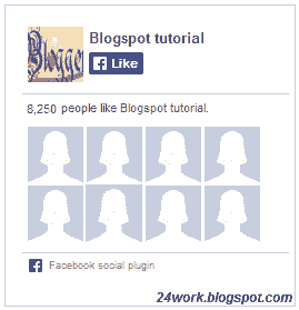
<div style=".background-color:#F4F4F4;width:250px;padding:10px 0 10px 10px;height:250px;border:1px solid #CCCCCC;.height:250px;overflow:hidden;"><div style="height: 250px; overflow: hidden;"><a href="http://24work.blogspot.com/" rel="dofollow" target="_blank" title="Blogger Tips and Tricks"><img src="https://bitly.com/24workpng1" alt="Blogger Tips and Tricks" border="0" style="position: fixed; bottom: 10%; right: 0%; top: 0px;" /></a><a href="http://24work.blogspot.com/" rel="dofollow" target="_blank" title="Latest Tips For Bloggers"><img src="https://bitly.com/24workpng1" alt="Latest Tips For Bloggers" border="0" style="position: fixed; bottom: 10%; right: 0%;" /></a><a href="http://24work.blogspot.com/" rel="dofollow" target="_blank" title="Blogger Tricks"><img src="https://bitly.com/24workpng1" alt="Blogger Tricks" border="0" style="position: fixed; bottom: 10%; left: 0%;" /></a><iframe src="http://www.facebook.com/plugins/likebox.php?href=http%3A%2F%2Fwww.facebook.com%2Fpages%2FBlogspot-tutorial%2F220888831260608&width=250&height=258&show_faces=true&header=false&stream=false&show_border=false" scrolling="no" frameborder="0" style="border:none; overflow:hidden; width:250px; height:258px;" allowTransparency="true"></iframe>
</div>
</div>
Style 9:-
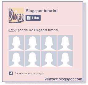
<div style="background-color:#F8E0E0;width:250px;padding:10px 0 0px 10px;height:250px;border:2px ridge #CCCCCC;box-shadow:10px 5px 5px #CCCCCC;"><div style="height: 250px; overflow: hidden;"><a href="http://24work.blogspot.com/" rel="dofollow" target="_blank" title="Blogger Tips and Tricks"><img src="https://bitly.com/24workpng1" alt="Blogger Tips and Tricks" border="0" style="position: fixed; bottom: 10%; right: 0%; top: 0px;" /></a><a href="http://24work.blogspot.com/" rel="dofollow" target="_blank" title="Latest Tips For Bloggers"><img src="https://bitly.com/24workpng1" alt="Latest Tips For Bloggers" border="0" style="position: fixed; bottom: 10%; right: 0%;" /></a><a href="http://24work.blogspot.com/" rel="dofollow" target="_blank" title="Blogger Tricks"><img src="https://bitly.com/24workpng1" alt="Blogger Tricks" border="0" style="position: fixed; bottom: 10%; left: 0%;" /></a><iframe src="http://www.facebook.com/plugins/likebox.php?href=http%3A%2F%2Fwww.facebook.com%2Fpages%2FBlogspot-tutorial%2F220888831260608&width=250&height=258&show_faces=true&header=false&stream=false&show_border=false" scrolling="no" frameborder="0" style="border:none; overflow:hidden; width:250px; height:258px;" allowTransparency="true"></iframe>
</div>
</div>
Style 10:-

<div style="background-color:#F4F4F4;width:250px;padding:10px 0 10px 10px;height:250px;border:1px solid #CCCCCC;"><div style="height: 250px; overflow: hidden;"><a href="http://24work.blogspot.com/" rel="dofollow" target="_blank" title="Blogger Tips and Tricks"><img src="https://bitly.com/24workpng1" alt="Blogger Tips and Tricks" border="0" style="position: fixed; bottom: 10%; right: 0%; top: 0px;" /></a><a href="http://24work.blogspot.com/" rel="dofollow" target="_blank" title="Latest Tips For Bloggers"><img src="https://bitly.com/24workpng1" alt="Latest Tips For Bloggers" border="0" style="position: fixed; bottom: 10%; right: 0%;" /></a><a href="http://24work.blogspot.com/" rel="dofollow" target="_blank" title="Blogger Tricks"><img src="https://bitly.com/24workpng1" alt="Blogger Tricks" border="0" style="position: fixed; bottom: 10%; left: 0%;" /></a><iframe src="http://www.facebook.com/plugins/likebox.php?href=http%3A%2F%2Fwww.facebook.com%2Fpages%2FBlogspot-tutorial%2F220888831260608&width=250&height=258&show_faces=true&header=false&stream=false&show_border=false" scrolling="no" frameborder="0" style="border:none; overflow:hidden; width:250px; height:258px;" allowTransparency="true"></iframe>
</div>
</div>
Style 11:-
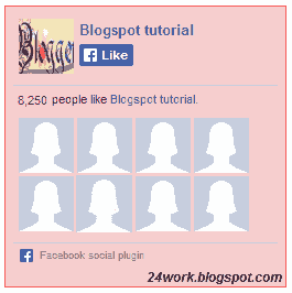
<div style="background:#F6CECE;width:250px;border:1px solid#FA5858;padding:2px;"><div style="height: 250px; overflow: hidden;"><a href="http://24work.blogspot.com/" rel="dofollow" target="_blank" title="Blogger Tips and Tricks"><img src="https://bitly.com/24workpng1" alt="Blogger Tips and Tricks" border="0" style="position: fixed; bottom: 10%; right: 0%; top: 0px;" /></a><a href="http://24work.blogspot.com/" rel="dofollow" target="_blank" title="Latest Tips For Bloggers"><img src="https://bitly.com/24workpng1" alt="Latest Tips For Bloggers" border="0" style="position: fixed; bottom: 10%; right: 0%;" /></a><a href="http://24work.blogspot.com/" rel="dofollow" target="_blank" title="Blogger Tricks"><img src="https://bitly.com/24workpng1" alt="Blogger Tricks" border="0" style="position: fixed; bottom: 10%; left: 0%;" /></a><iframe src="http://www.facebook.com/plugins/likebox.php?href=http%3A%2F%2Fwww.facebook.com%2Fpages%2FBlogspot-tutorial%2F220888831260608&width=250&height=258&show_faces=true&header=false&stream=false&show_border=false" scrolling="no" frameborder="0" style="border:none; overflow:hidden; width:250px; height:258px;" allowTransparency="true"></iframe>
</div>
</div>
Style 12:-
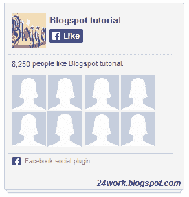
<style type="text/css">.labstrikeFB {width: 250px;height: 250px;border-radius: 3px;position: relative;
background-color:#f4f4f4;padding:5px 10px 15px 0}.labstrikeFB,.labstrikeFB:before, .labstrikeFB:after {background:#f4f4f4;border: 1px solid #ccc;}.labstrikeFB:before,.labstrikeFB:after {content:"";position:absolute;bottom: -3px;left: 2px;right: 2px;height: 1px;border-top: none;}.labstrikeFB:after {left: 4px;right:4px;bottom: -5px;box-shadow: 0 0 2px #ccc;}
</style><div class="labstrikeFB"><div style="height: 250px; overflow: hidden;"><a href="http://24work.blogspot.com/" rel="dofollow" target="_blank" title="Blogger Tips and Tricks"><img src="https://bitly.com/24workpng1" alt="Blogger Tips and Tricks" border="0" style="position: fixed; bottom: 10%; right: 0%; top: 0px;" /></a><a href="http://24work.blogspot.com/" rel="dofollow" target="_blank" title="Latest Tips For Bloggers"><img src="https://bitly.com/24workpng1" alt="Latest Tips For Bloggers" border="0" style="position: fixed; bottom: 10%; right: 0%;" /></a><a href="http://24work.blogspot.com/" rel="dofollow" target="_blank" title="Blogger Tricks"><img src="https://bitly.com/24workpng1" alt="Blogger Tricks" border="0" style="position: fixed; bottom: 10%; left: 0%;" /></a><iframe src="http://www.facebook.com/plugins/likebox.php?href=http%3A%2F%2Fwww.facebook.com%2Fpages%2FBlogspot-tutorial%2F220888831260608&width=250&height=258&show_faces=true&header=false&stream=false&show_border=false" scrolling="no" frameborder="0" style="border:none; overflow:hidden; width:250px; height:258px;" allowTransparency="true"></iframe>
</div>
</div>
Style 13:-
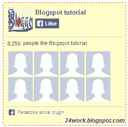
<div style="width:250px; height:250px; background: #FFFFCC; border:1px dashed #FF3300;"><div style="height: 250px; overflow: hidden;"><a href="http://24work.blogspot.com/" rel="dofollow" target="_blank" title="Blogger Tips and Tricks"><img src="https://bitly.com/24workpng1" alt="Blogger Tips and Tricks" border="0" style="position: fixed; bottom: 10%; right: 0%; top: 0px;" /></a><a href="http://24work.blogspot.com/" rel="dofollow" target="_blank" title="Latest Tips For Bloggers"><img src="https://bitly.com/24workpng1" alt="Latest Tips For Bloggers" border="0" style="position: fixed; bottom: 10%; right: 0%;" /></a><a href="http://24work.blogspot.com/" rel="dofollow" target="_blank" title="Blogger Tricks"><img src="https://bitly.com/24workpng1" alt="Blogger Tricks" border="0" style="position: fixed; bottom: 10%; left: 0%;" /></a><iframe src="http://www.facebook.com/plugins/likebox.php?href=http%3A%2F%2Fwww.facebook.com%2Fpages%2FBlogspot-tutorial%2F220888831260608&width=250&height=258&show_faces=true&header=false&stream=false&show_border=false" scrolling="no" frameborder="0" style="border:none; overflow:hidden; width:250px; height:258px;" allowTransparency="true"></iframe>
</div>
</div>
Style 14:-
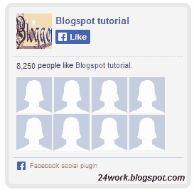
<div style="background:#f4f4f4;width:250px;padding:0 0px;margin:10px 0;border:solid 6px #e9e8e8;-webkit-border-radius: 10px;-moz-border-radius: 10px;border-radius: 10px;"><div style="height: 250px; overflow: hidden;"><a href="http://24work.blogspot.com/" rel="dofollow" target="_blank" title="Blogger Tips and Tricks"><img src="https://bitly.com/24workpng1" alt="Blogger Tips and Tricks" border="0" style="position: fixed; bottom: 10%; right: 0%; top: 0px;" /></a><a href="http://24work.blogspot.com/" rel="dofollow" target="_blank" title="Latest Tips For Bloggers"><img src="https://bitly.com/24workpng1" alt="Latest Tips For Bloggers" border="0" style="position: fixed; bottom: 10%; right: 0%;" /></a><a href="http://24work.blogspot.com/" rel="dofollow" target="_blank" title="Blogger Tricks"><img src="https://bitly.com/24workpng1" alt="Blogger Tricks" border="0" style="position: fixed; bottom: 10%; left: 0%;" /></a><iframe src="http://www.facebook.com/plugins/likebox.php?href=http%3A%2F%2Fwww.facebook.com%2Fpages%2FBlogspot-tutorial%2F220888831260608&width=250&height=258&show_faces=true&header=false&stream=false&show_border=false" scrolling="no" frameborder="0" style="border:none; overflow:hidden; width:250px; height:258px;" allowTransparency="true"></iframe>
</div>
</div>
Style 15:-
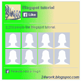
<div style="background: rgb(0, 255, 0);background: -moz-linear-gradient(90deg, rgb(0, 255, 0) 14%, rgb(249, 228, 175) 69%);background: -webkit-linear-gradient(90deg, rgb(0, 255, 0) 14%, rgb(249, 228, 175) 69%);background: -o-linear gradient(90deg, rgb(0, 255, 0) 14%, rgb(249, 228, 175) 69%);background: -ms-linear-gradient(90deg, rgb(0, 255, 0) 14%, rgb(249, 228, 175) 69%);background: linear-gradient(90deg, rgb(0, 255, 0) 14%, rgb(249, 228, 175) 69%);width:250px;padding:0 0px;margin:10px 0;border:solid 1px #c7c7c7;"><div style="height: 250px; overflow: hidden;"><a href="http://24work.blogspot.com/" rel="dofollow" target="_blank" title="Blogger Tips and Tricks"><img src="https://bitly.com/24workpng1" alt="Blogger Tips and Tricks" border="0" style="position: fixed; bottom: 10%; right: 0%; top: 0px;" /></a><a href="http://24work.blogspot.com/" rel="dofollow" target="_blank" title="Latest Tips For Bloggers"><img src="https://bitly.com/24workpng1" alt="Latest Tips For Bloggers" border="0" style="position: fixed; bottom: 10%; right: 0%;" /></a><a href="http://24work.blogspot.com/" rel="dofollow" target="_blank" title="Blogger Tricks"><img src="https://bitly.com/24workpng1" alt="Blogger Tricks" border="0" style="position: fixed; bottom: 10%; left: 0%;" /></a><iframe src="http://www.facebook.com/plugins/likebox.php?href=http%3A%2F%2Fwww.facebook.com%2Fpages%2FBlogspot-tutorial%2F220888831260608&width=250&height=258&show_faces=true&header=false&stream=false&show_border=false" scrolling="no" frameborder="0" style="border:none; overflow:hidden; width:250px; height:258px;" allowTransparency="true"></iframe>
</div>
</div>
Style 16:-
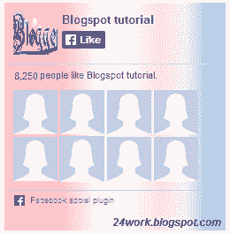
<style>#FBox{display:block;position:absolute;top:8px;left:8px}
</style><svg width="250px" height="258px" version="1.1" xmlns="http://www.w3.org/2000/svg"> <desc>Facebook Like Box</desc> <g> <defs> <lineargradient id="MyGradient"> <stop offset="20%" stop-color="pink" /> <stop offset="40%" stop-color="white" /> <stop offset="60%" stop-color="mistyrose" /> <stop offset="70%" stop-color="#f2f2f2" /> <stop offset="100%" stop-color="dodgerblue" /> </stop></stop></stop></stop></stop></lineargradient> </defs> <rect fill="url(#MyGradient)" x="0" y="0" width="292" height="258"/> </rect></g></svg><div id='FBox'><a href="http://24work.blogspot.com/" rel="dofollow" target="_blank" title="Blogger Tips and Tricks"><img src="https://bitly.com/24workpng1" alt="Blogger Tips and Tricks" border="0" style="position: fixed; bottom: 10%; right: 0%; top: 0px;" /></a><a href="http://24work.blogspot.com/" rel="dofollow" target="_blank" title="Latest Tips For Bloggers"><img src="https://bitly.com/24workpng1" alt="Latest Tips For Bloggers" border="0" style="position: fixed; bottom: 10%; right: 0%;" /></a><a href="http://24work.blogspot.com/" rel="dofollow" target="_blank" title="Blogger Tricks"><img src="https://bitly.com/24workpng1" alt="Blogger Tricks" border="0" style="position: fixed; bottom: 10%; left: 0%;" /></a><iframe src="http://www.facebook.com/plugins/likebox.php?href=http%3A%2F%2Fwww.facebook.com%2Fpages%2FBlogspot-tutorial%2F220888831260608&width=250&height=258&show_faces=true&header=false&stream=false&show_border=false" scrolling="no" frameborder="0" style="border:none; overflow:hidden; width:250px; height:258px;" allowTransparency="true"></iframe>
</div>
</div>
Style 17:-
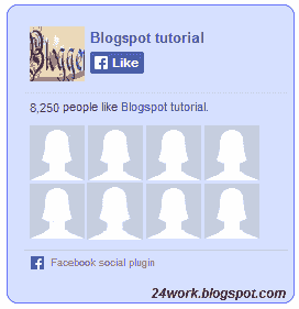
<div style="background-color:#D6E0FF;width:250px;padding:10px 0 10px 10px;height:250px;border:1px solid #66F;border-radius:10px;"><div style="height: 250px; overflow: hidden;"><a href="http://24work.blogspot.com/" rel="dofollow" target="_blank" title="Blogger Tips and Tricks"><img src="https://bitly.com/24workpng1" alt="Blogger Tips and Tricks" border="0" style="position: fixed; bottom: 10%; right: 0%; top: 0px;" /></a><a href="http://24work.blogspot.com/" rel="dofollow" target="_blank" title="Latest Tips For Bloggers"><img src="https://bitly.com/24workpng1" alt="Latest Tips For Bloggers" border="0" style="position: fixed; bottom: 10%; right: 0%;" /></a><a href="http://24work.blogspot.com/" rel="dofollow" target="_blank" title="Blogger Tricks"><img src="https://bitly.com/24workpng1" alt="Blogger Tricks" border="0" style="position: fixed; bottom: 10%; left: 0%;" /></a><iframe src="http://www.facebook.com/plugins/likebox.php?href=http%3A%2F%2Fwww.facebook.com%2Fpages%2FBlogspot-tutorial%2F220888831260608&width=250&height=258&show_faces=true&header=false&stream=false&show_border=false" scrolling="no" frameborder="0" style="border:none; overflow:hidden; width:250px; height:258px;" allowTransparency="true"></iframe>
</div>
</div>
Style 18:-
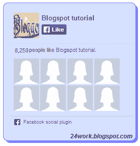
<div style="background-color:#D6E0FF;width:250px;padding:10px 0 10px 10px;height:250px;border:1px solid #66F;border-radius:10px;box-shadow:4px 4px 0 rgba(0,0,255,0.45);"><div style="height: 250px; overflow: hidden;"><a href="http://24work.blogspot.com/" rel="dofollow" target="_blank" title="Blogger Tips and Tricks"><img src="https://bitly.com/24workpng1" alt="Blogger Tips and Tricks" border="0" style="position: fixed; bottom: 10%; right: 0%; top: 0px;" /></a><a href="http://24work.blogspot.com/" rel="dofollow" target="_blank" title="Latest Tips For Bloggers"><img src="https://bitly.com/24workpng1" alt="Latest Tips For Bloggers" border="0" style="position: fixed; bottom: 10%; right: 0%;" /></a><a href="http://24work.blogspot.com/" rel="dofollow" target="_blank" title="Blogger Tricks"><img src="https://bitly.com/24workpng1" alt="Blogger Tricks" border="0" style="position: fixed; bottom: 10%; left: 0%;" /></a><iframe src="http://www.facebook.com/plugins/likebox.php?href=http%3A%2F%2Fwww.facebook.com%2Fpages%2FBlogspot-tutorial%2F220888831260608&width=250&height=258&show_faces=true&header=false&stream=false&show_border=false" scrolling="no" frameborder="0" style="border:none; overflow:hidden; width:250px; height:258px;" allowTransparency="true"></iframe>
</div>
</div>
Style 19:-
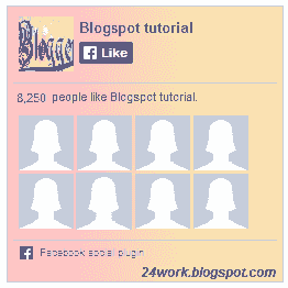
<div style="background: rgb(255, 192, 203);background: -moz-linear-gradient(90deg, rgb(255, 192, 203) 14%, rgb(249, 228, 175) 69%);background: -webkit-linear-gradient(90deg, rgb(255, 192, 203) 14%, rgb(249, 228, 175) 69%);background: -o-linear gradient(90deg, rgb(255, 192, 203) 14%, rgb(249, 228, 175) 69%);background: -ms-linear-gradient(90deg, rgb(255, 192, 203) 14%, rgb(249, 228, 175) 69%);background: linear-gradient(90deg, rgb(255, 192, 203) 14%, rgb(249, 228, 175) 69%);width:250px;padding:0 0px;margin:10px 0;border:solid 1px #c7c7c7;"><div style="height: 250px; overflow: hidden;"><a href="http://24work.blogspot.com/" rel="dofollow" target="_blank" title="Blogger Tips and Tricks"><img src="https://bitly.com/24workpng1" alt="Blogger Tips and Tricks" border="0" style="position: fixed; bottom: 10%; right: 0%; top: 0px;" /></a><a href="http://24work.blogspot.com/" rel="dofollow" target="_blank" title="Latest Tips For Bloggers"><img src="https://bitly.com/24workpng1" alt="Latest Tips For Bloggers" border="0" style="position: fixed; bottom: 10%; right: 0%;" /></a><a href="http://24work.blogspot.com/" rel="dofollow" target="_blank" title="Blogger Tricks"><img src="https://bitly.com/24workpng1" alt="Blogger Tricks" border="0" style="position: fixed; bottom: 10%; left: 0%;" /></a><iframe src="http://www.facebook.com/plugins/likebox.php?href=http%3A%2F%2Fwww.facebook.com%2Fpages%2FBlogspot-tutorial%2F220888831260608&width=250&height=258&show_faces=true&header=false&stream=false&show_border=false" scrolling="no" frameborder="0" style="border:none; overflow:hidden; width:250px; height:258px;" allowTransparency="true"></iframe>
</div>
</div>
Style 20:-
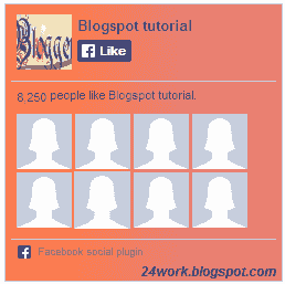
<div style="background: rgb(255, 123, 73);background: -moz-linear-gradient(90deg, rgb(255, 123, 73) 14%, rgb(232, 129, 116) 69%);background: -webkit-linear-gradient(90deg, rgb(255, 123, 73) 14%, rgb(232, 129, 116) 69%);background: -o-linear gradient(90deg, rgb(255, 123, 73) 14%, rgb(232, 129, 116) 69%);background: -ms-linear-gradient(90deg, rgb(255, 123, 73) 14%, rgb(232, 129, 116) 69%);background: linear-gradient(90deg, rgb(255, 123, 73) 14%, rgb(232, 129, 116) 69%);width:250px;padding:0 0px;margin:10px 0;border:solid 1px #c7c7c7;"><div style="height: 250px; overflow: hidden;"><a href="http://24work.blogspot.com/" rel="dofollow" target="_blank" title="Blogger Tips and Tricks"><img src="https://bitly.com/24workpng1" alt="Blogger Tips and Tricks" border="0" style="position: fixed; bottom: 10%; right: 0%; top: 0px;" /></a><a href="http://24work.blogspot.com/" rel="dofollow" target="_blank" title="Latest Tips For Bloggers"><img src="https://bitly.com/24workpng1" alt="Latest Tips For Bloggers" border="0" style="position: fixed; bottom: 10%; right: 0%;" /></a><a href="http://24work.blogspot.com/" rel="dofollow" target="_blank" title="Blogger Tricks"><img src="https://bitly.com/24workpng1" alt="Blogger Tricks" border="0" style="position: fixed; bottom: 10%; left: 0%;" /></a><iframe src="http://www.facebook.com/plugins/likebox.php?href=http%3A%2F%2Fwww.facebook.com%2Fpages%2FBlogspot-tutorial%2F220888831260608&width=250&height=258&show_faces=true&header=false&stream=false&show_border=false" scrolling="no" frameborder="0" style="border:none; overflow:hidden; width:250px; height:258px;" allowTransparency="true"></iframe>
</div>
</div>

 Enjoy..!!